Arts
Touring
Connector
Your Audience Awaits
Ontario Presents came to us with a project: update the current “Ontario Presents” logo to reflect the changing landscape of the Arts Touring Community.
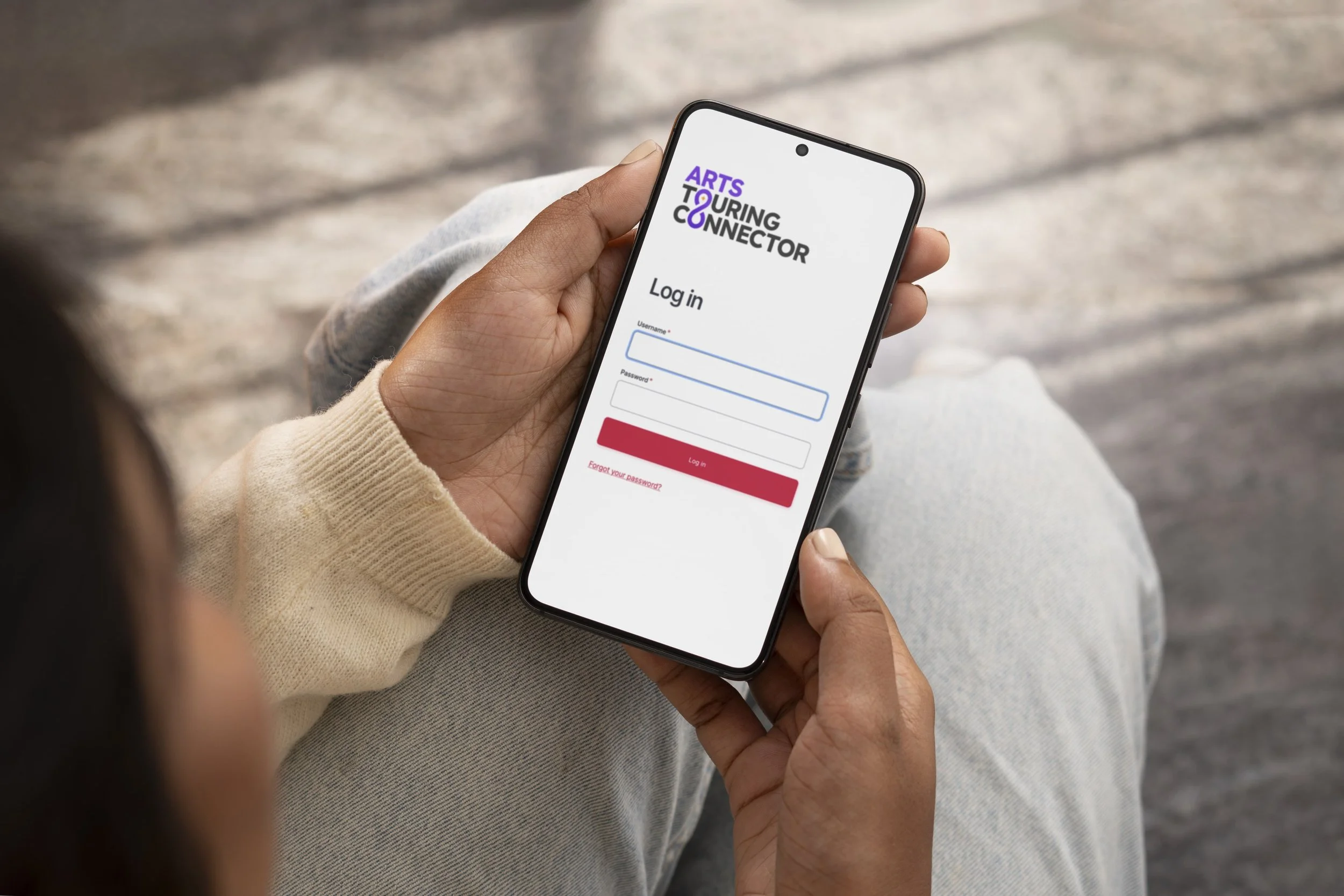
They wanted the new logo to be strong and clean, responsive and available in English and French.
They were only planning to use it for email signatures, event handouts, and minimal graphics, so unlike traditional branding, they did not need a complete brand book with fonts, colours, and best practices.

“If I hand my card to an international person, what would their first thought be as to what my company does?”
We went through several rounds of concepts and revisions. The Cultch, CAPACOA, and Peanut Butter Studio were among some of the inspirations and references thrown around, but we decided to go with something simpler.
We played with imagery that encapsulates “the arts” and “performing”; arrows, globes, chains, pathways, a microphone, a theatre stage, etc. None of those symbols worked well; they were too limiting to a single category. (music, painting, photography, singing, etc)
Something I like to ask myself when designing a logo, especially for a brand, is what might enhance cleanliness and readability.
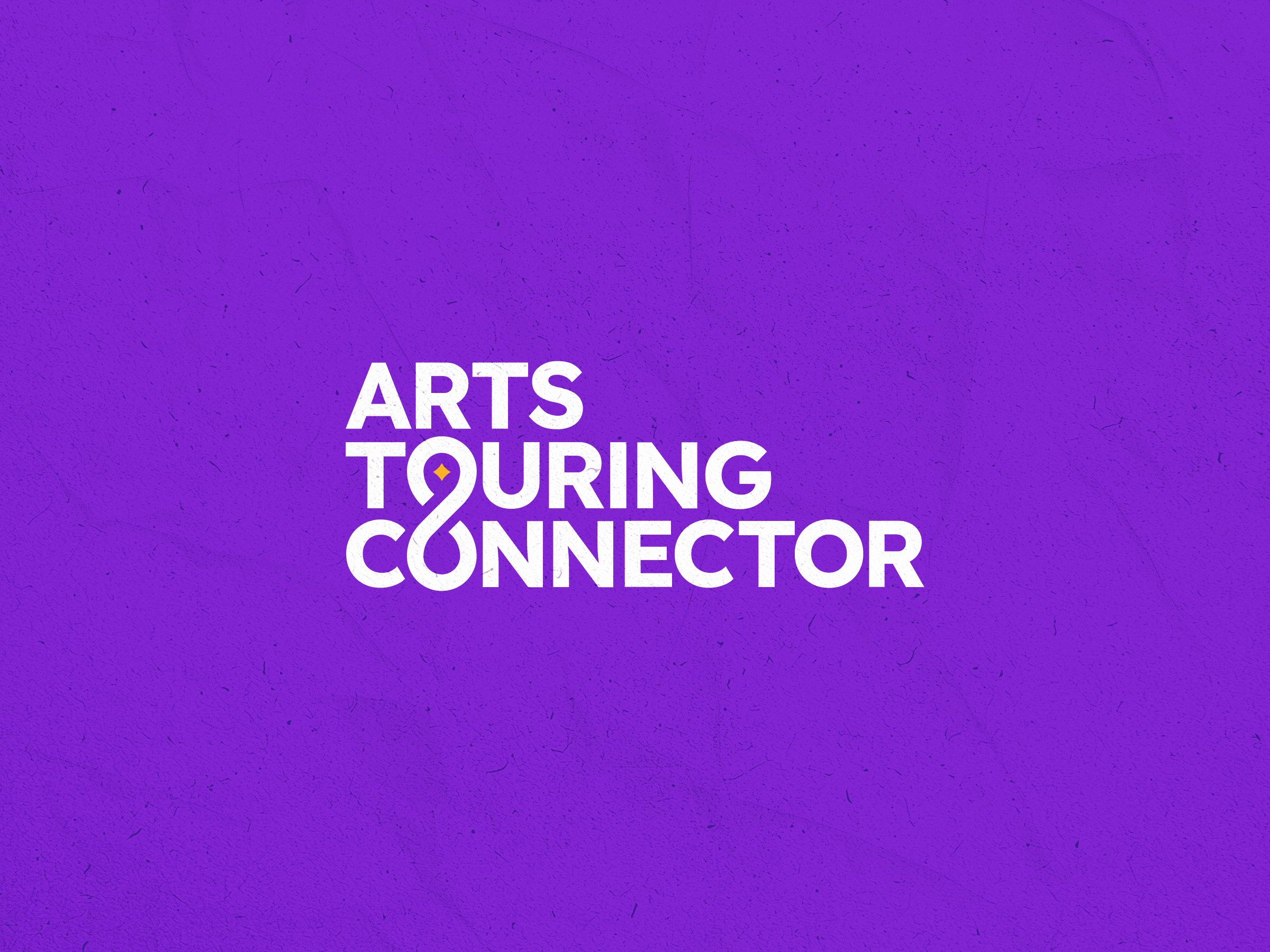

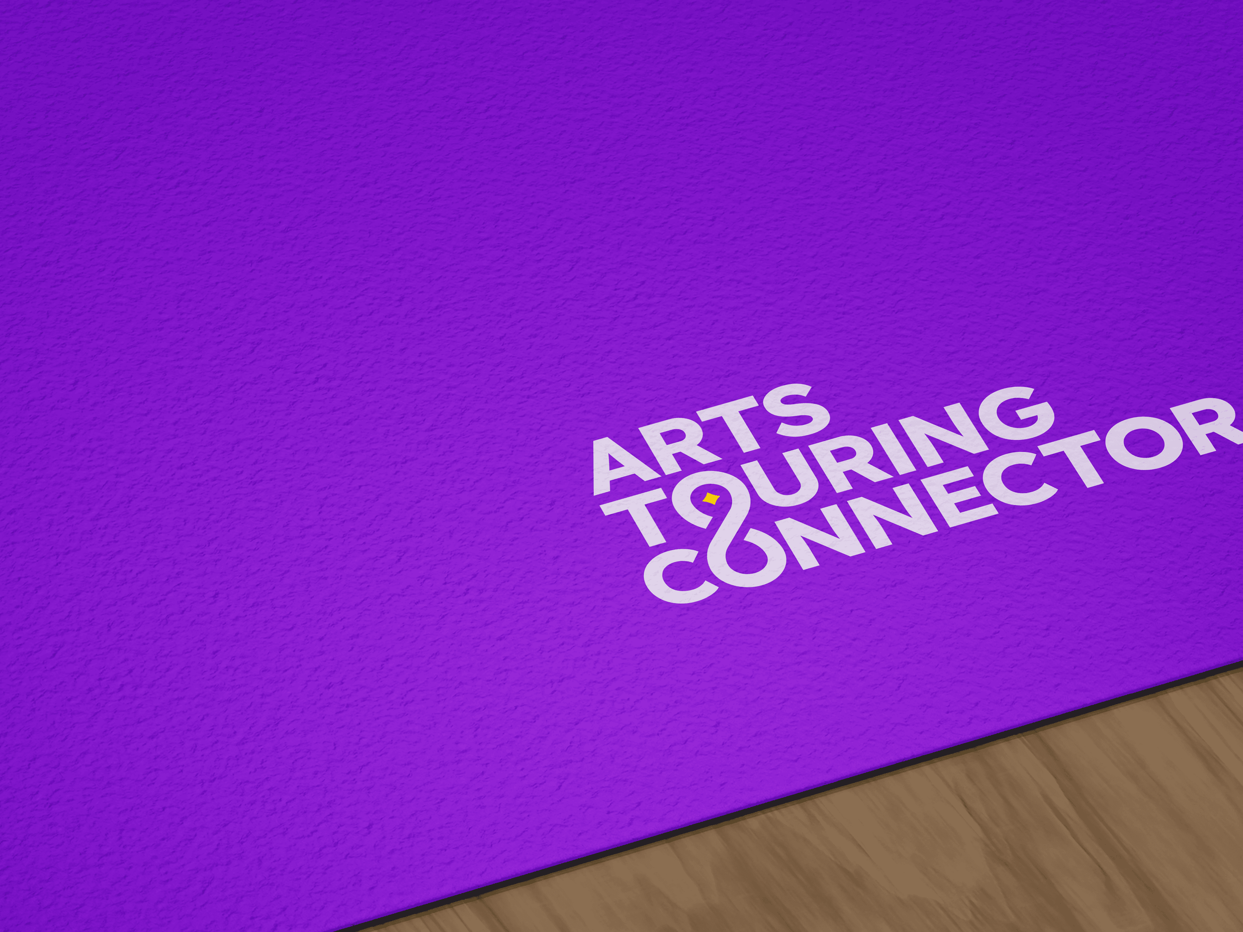

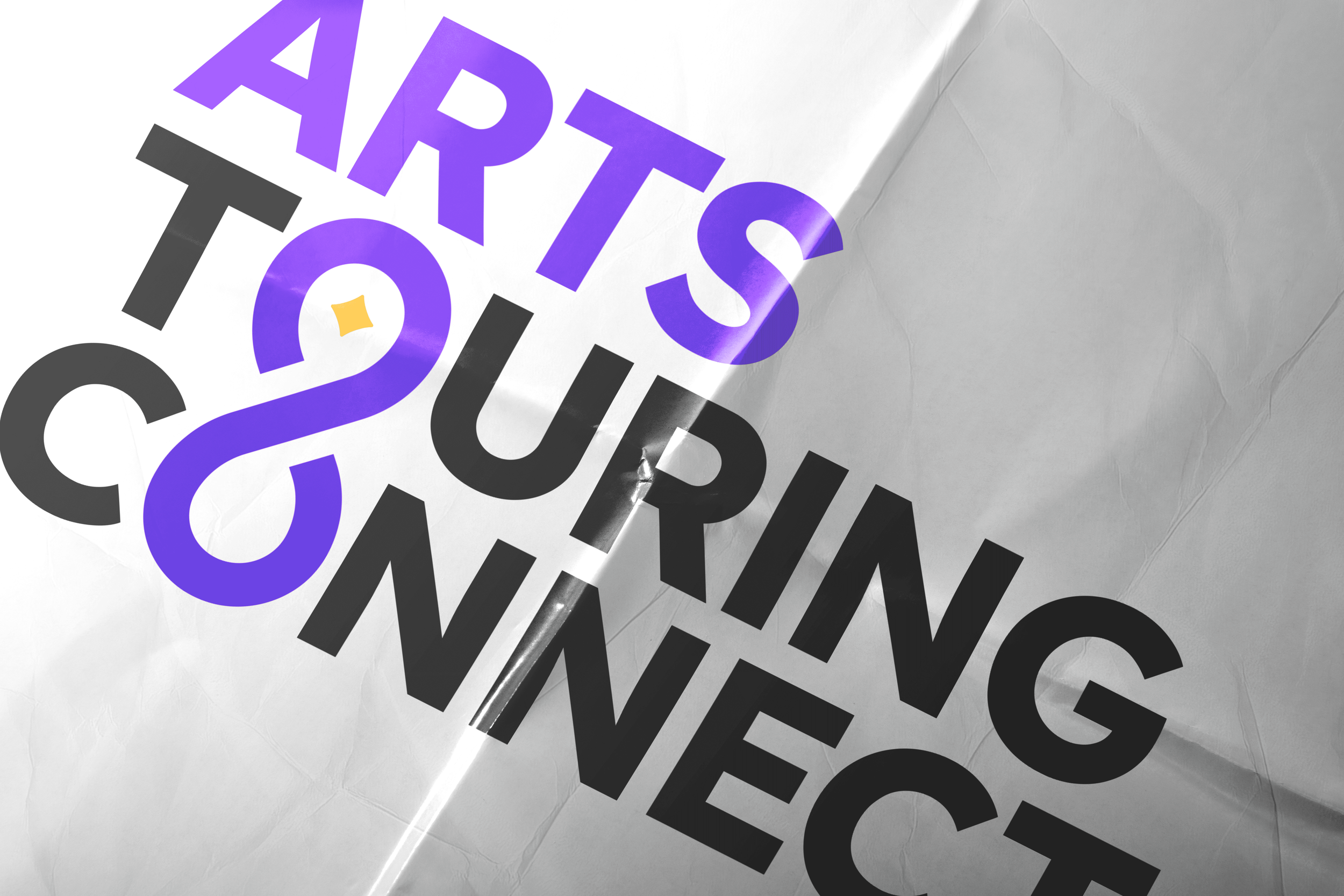

We decided that a combination of the infinity symbol and chain would represent the infinite number of connections you can make in the arts community.
The
Final
Result


Project
Overview
-
Update the current “Ontario Presents” logo to reflect the changing landscape of the Arts Touring Community.
Avoid red (too nationalistic)
Simple, clean, implies ‘connection.’
Potential for arrow ‘travel’, ‘pathways.’
-
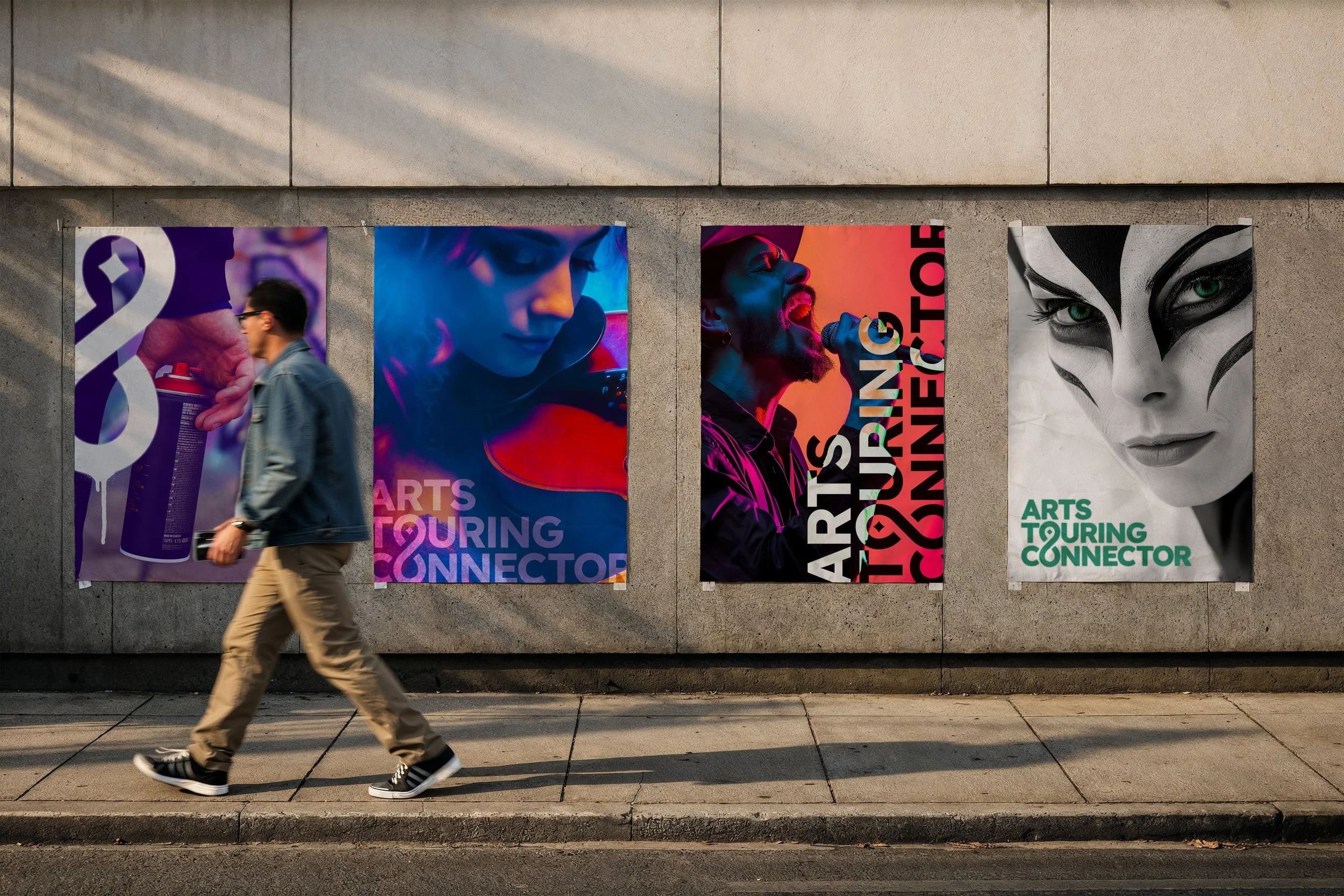
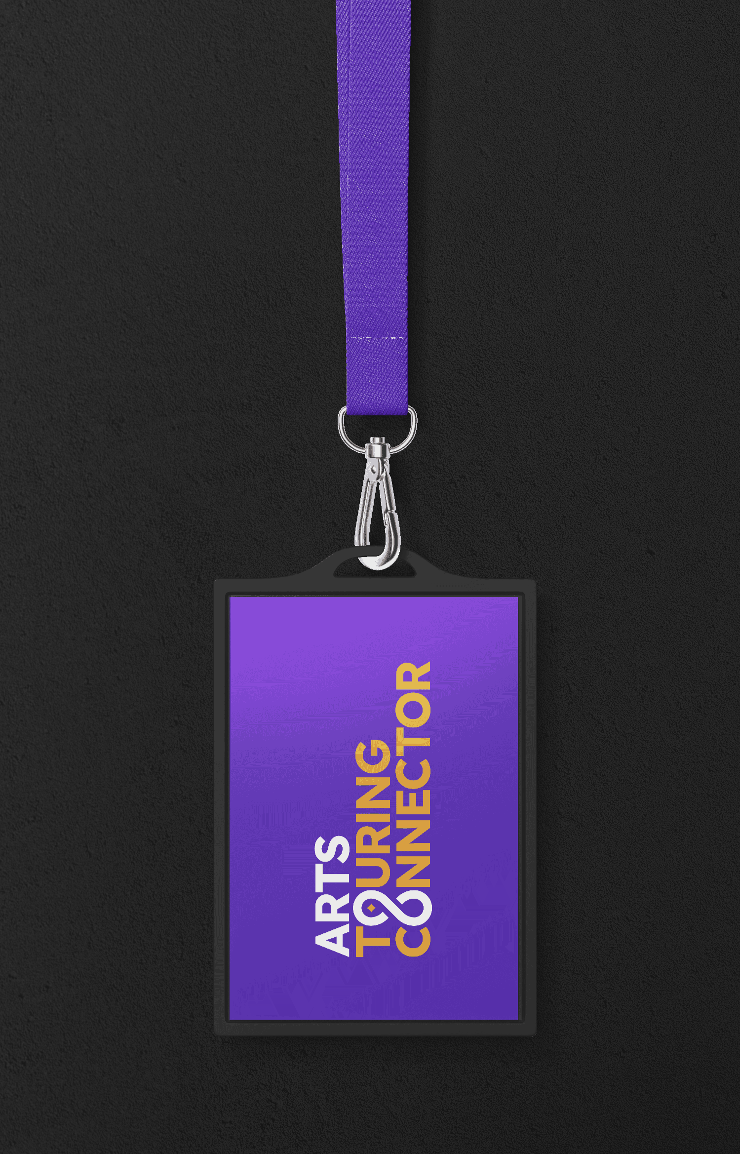
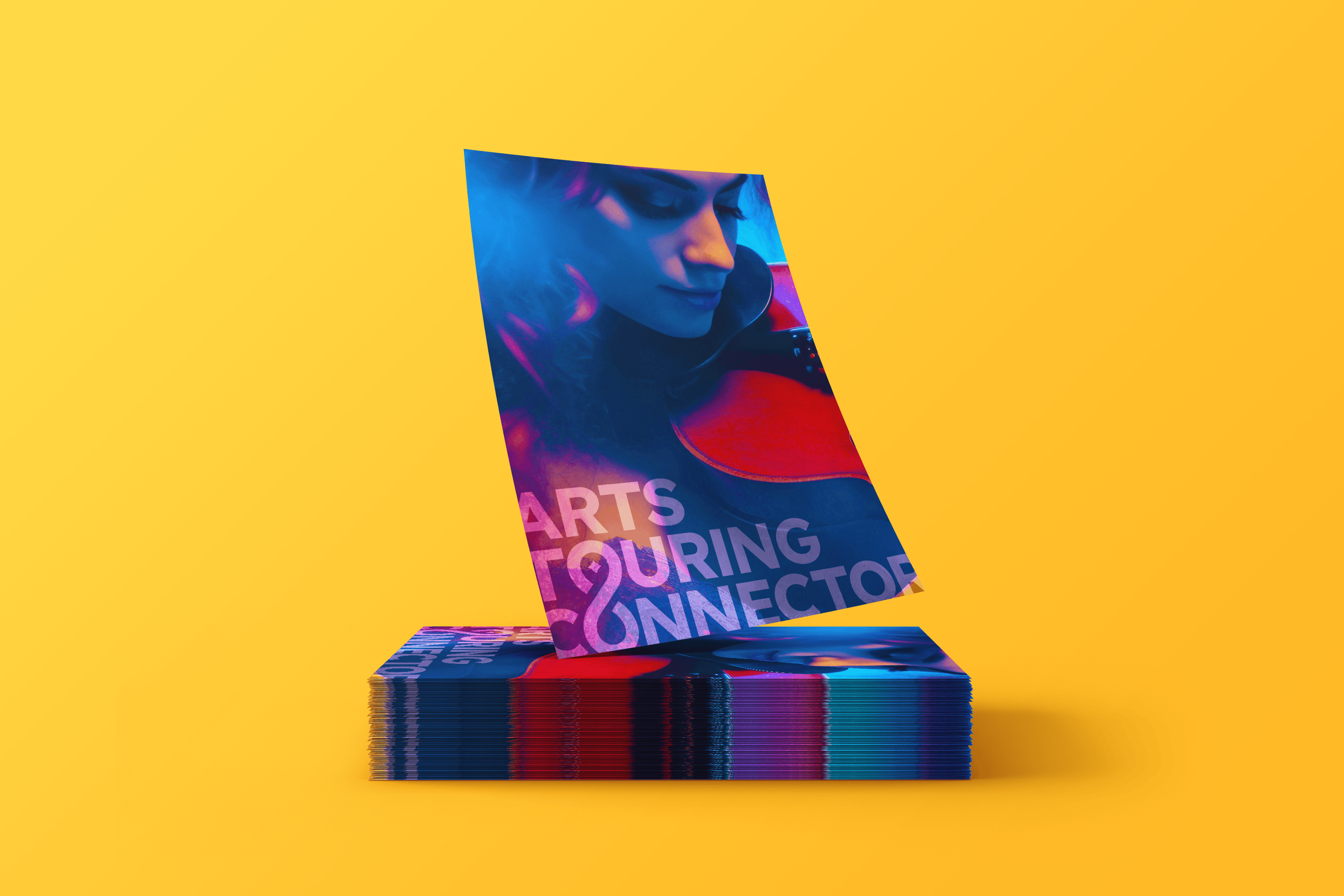
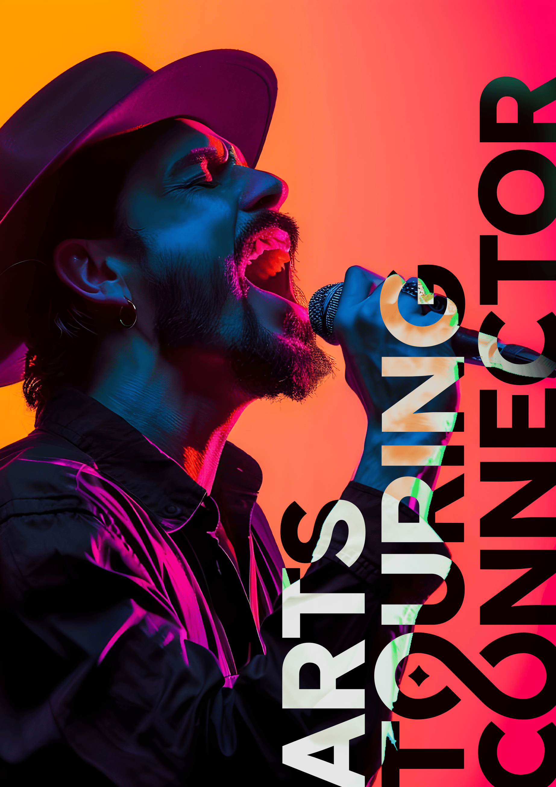
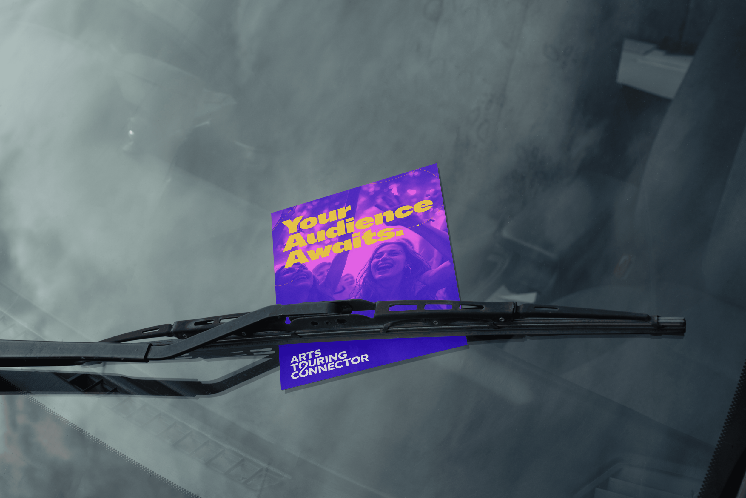
While the logo was the only ask, we decided to create a few mockups for posters, stickers, totes, and pins to help sell the authenticity of the new logo.
-
2021
-
Arts & Entertainment